Gradycarter's Blog

Just another WordPress.com site

Tag: Jobs

America in 2013, as Told in Charts

One of my favorite things about there being a “New Year” is that people get a feeling that they can better themselves, and start over somewhat. In order for the yearly reset button to be worth anything at all there must be need for change, and thus we have a reason to ask ourselves about the past and what should stay the same, as well as what needs to change. This article by Steve Rattner addresses our nation with plenty of wonderful words, but even better he also does so with charts! I hope that you enjoy this, and if you don’t I beg of you to kick yourself.

-Grady

America in 2013, as Told in Charts

Posted: 31 Dec 2013 09:45 AM PST

Originally published in the New York Times.

Looking back on 2013, many of the economic and political themes seemed familiar: a weak economy. Growing income inequality. Gridlock in Washington. Partisan wrangling over fiscal policy. But others, like the disastrous rollout of the Affordable Care Act HealthCare.gov website and the government shutdown, were new or at least revivals. Below are 10 charts to illustrate a depressing first year of President Obama’s second term:

Graphic

Not only did trends of recent years continue in 2013 – particularly the diverging fortunes of the rich and everyone else — but in some ways they accelerated. The stock market, as measured by the Standard & Poor’s index, was up a stunning 32 percent (through Dec. 27). Corporate profits rose to a record $2.1 trillion. Meanwhile, incomes remained nearly flat and jobs tallies grew slowly. Through Oct. 30, earnings were up just 1.4 percent, an even smaller increase than in 2012. The only relative bright spot for the average American was housing; thanks in part to the aggressive efforts by the Federal Reserve to hold down interest rates, sale prices of homes were up by 13.3 percent in September, compared with a year earlier.

Graphic

Economic growth — a likely increase in gross domestic product of just 1.8 percent in 2013, after adjusting for inflation — was also unbalanced in other ways, particularly the impact of the government. The nation’s quickly falling deficit (it dropped from $1.09 trillion to $680 billion in a single year) cost dearly in economic activity. Spending by cash-strapped consumers and investment by skittish businesses both grew at slightly below customary rates. A flat-lining Europe dented President Obama’s pledge to double American exports by 2015. On the other hand, home building and related residential activity, depressed since the onset of the financial crisis, provided a second annual lift to the economy.

Graphic

Employment remained an overarching problem. While job growth has picked up steam in the last few months, the fall’s higher pace of job creation – around 200,000 per month – would still not be nearly enough to bring unemployment down to pre-recession levels. According to calculations by the Brookings Institution’s Hamilton Project, even if the 200,000 jobs per month rate were maintained, the unemployment rate would not fall to the November 2007 level of 4.7 percent for another five years.

Graphic

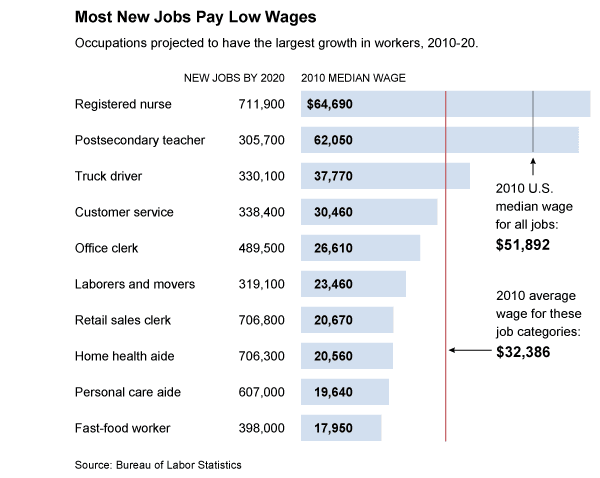
Not only has the job recovery been sluggish, but also a disproportionate number of those that have been created have been in lower wage occupations, such as retail clerks and fast-food workers. And that trend is projected (by the Bureau of Labor Statistics) to continue; using a simple average, the 10 job categories expected to add the most jobs during the current decade boasted a collective median wage of $32,386 in 2010, roughly $15 per hour and far below the United States median of $51,892 at the time. Seven of the 10 categories pay below this average. Note the conspicuous absence of manufacturing; it may be recovering, but it isn’t what is driving new jobs.

Graphic

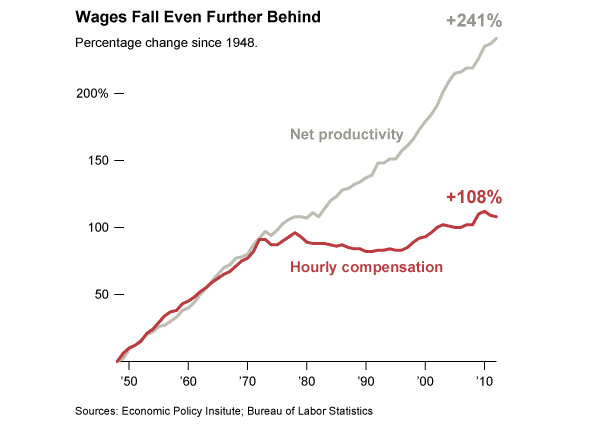
Wage increases haven’t been paltry because the efficiency of the American worker has flagged; indeed, productivity has continued to chug along. But those productivity gains have simply not been passed on to workers. Between 2000 and 2012, productivity rose by 22 percent while wages increased by 7.7 percent. The divergence was particularly great over the last three years of that period – productivity up 4.6 percent and real wages down 1.1 percent. For this failure of the American worker to be rewarded for his growing output, blame a variety of factors, perhaps most important, globalization, which has allowed companies to move production to whatever part of the planet offers the lowest cost labor. In that respect, American workers remain in a race to the bottom.

Graphic

The troubles with the Affordable Care Act’s HealthCare.gov rollout sure grabbed daily headlines this fall. But throughout the commotion, little mention was made of the most fundamental aspect of the law: the way in which it raises nearly $2 trillion over the next decade — mostly from wealthy individuals and health care providers — and uses the money to fund the largest expansion in insurance coverage since Medicare was created nearly 50 years ago. As shown above, the end result should be better health care options for those closer to the bottom end of the income scale, through the Medicaid expansion and creation of exchanges with subsidies for most participants. The intended result: 25 million fewer uninsured Americans. Yes, this is redistribution on a grand scale, and we should all be very proud of it. But as evidenced by Obamacare’s consistently poor poll numbers, most Americans are not feeling charitable toward the less well off.

Graphic

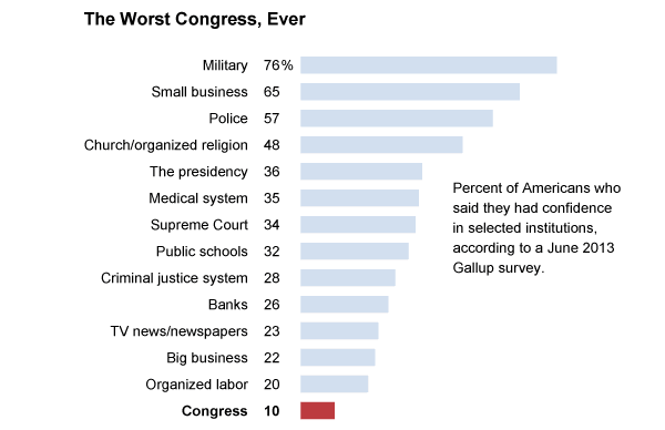
Trust in many American institutions has been declining, but few institutions have fallen so far out of grace as Congress. Last year, I showed that the previous Congress was the least productive Congress in modern times, including the famous Do-Nothing Congress of 1947-48, passing just 238 laws, 37 percent of the average of the 32 Congresses that preceded it. In 2013, the first year of this Congress, the number of new laws passed fell further, to 55 (as of Nov. 30), seven fewer than during the same period in 2011. As a result, Congress now stands dead last in approval rating among key American institutions – far below other braches of government, below news outlets, below banks and even below big business.

Graphic

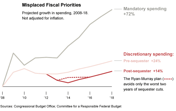
Congress well deserves that poll standing, in significant part because of the damage that it has done to the federal budget. The combination of Republican determination to cut spending and Democratic insistence that none of the entitlement programs (such as Medicare and Social Security) be meaningfully affected has resulted in the utterly inane policy of starving key domestic programs, including education, infrastructure and research and development. The recent budget fight and subsequent agreement did nothing to change that trajectory. As shown by the red line above, all that resulted was avoiding the worst two years of forced budget cuts to these programs; for the 10 years beginning in 2008, this important spending will rise slightly in nominal numbers but will fall by 5 percent, after adjusting for inflation.

Graphic

The dysfunction in Washington has taken its toll in other important ways. Not only has business confidence been shaken, but each new political battle has also been terrifying for consumers. Back in the summer of 2011, when the United States had its AAA credit rating removed by S.&P. after it flirted with default, consumer confidence recorded the second biggest two-month drop ever, behind only the aftermath of Hurricane Katrina. A smaller decline occurred at the end of 2012 when Congress nearly went over a fiscal cliff. Beginning this past July, consumer confidence dropped to its lowest level in nearly two years as a result of the government shutdown, the A.C.A. problems and related battles. Now, a two-year budget nearly in hand, Americans’ moods seem to have improved. At a time when we need consumers to spend (prudently), these periods of faltering confidence have real economic consequences.

Graphic

In contrast to the mood in most of the country and the still slow economy, Silicon Valley is partying again, albeit not quite like 1999. The Facebook initial public offering in May 2012 helped usher in a resurgence of excitement among investors for anything that looks like a sexy new high-tech service. This year’s poster child I.P.O. was Twitter, which set a new record of one kind among recent major technology I.P.O.’s: its valuation of more than 28 times its revenues. That didn’t daunt investors; the stock promptly more than doubled and now trades at 65 times revenues. (Of course, there are no profits.)

Morning Joe Charts on Government Printing and Buying Money – Steve Rattner

StevenRattner.com: Morning Joe Charts: Fed
Morning Joe Charts: Fed

Posted: 20 Jun 2013 11:55 AM PDT

If you have time I recommend watching the video by clicking on the link below.

On yesterday’s Morning Joe, Steven Rattner discusses the growing number of bonds purchased by the Fed in its efforts to stimulate the economy. He shows how markets have reacted to Ben Bernanke’s pronouncements that the Fed will begin tapering down its bond-buying program should the economy continue to improve. Click here to view the video.

(Note: Red bulls-eyes on the last chart indicate statements made by Bernanke.)

20130621-104721.jpg

20130621-104732.jpg

20130621-104740.jpg

The three dots in the chart above represent times when Chairman of the Federal Reserve Ben Bernanke has spoken publicly. The most recent example of this showed some short term turmoil on the stock market.

20130621-110044.jpg

20130621-110056.jpg

Jobs Update in the Economy – Steve Rattner (4/8/13)

Morning Joe Charts: Jobs – April 8, 2013

These are just some figures you might want to know about. There are many moving parts here, and jobs reports could be better, but let’s make sure that we note that the deficit is decreasing. This means that if people are saying that we’re increasing spending they are un/misinformed. With that said, things could be better on all sides, but they could of course be much worse.

One of the biggest mistakes we could make in looking at all of this is making political hay of the final chart. Not that it’s unfair to ask questions and make arguments about the effects of policy on jobs, but assuming that low participation by able bodied workers in the American economy is all due to President Obama is simply not wise. I’ve posted about this before, but technology and outsourcing labor has created a dichotomy in our economy, where the stock market is booming and nontechnical jobs are evaporating. This is a complicated time, and politicization of big problems like this could prevent us from actually getting past them.

1. Real Hourl Wages 2. Six Month Deficit 3. Labor Force Participation

Three Million Open Jobs in U.S., But Who’s Qualified? – 60 Minutes

Three million open jobs in U.S., but who’s qualified? – 60 Minutes.

As we have this widely contentious conversation about jobs in America this is a pretty interesting report. It is actually kind of a swipe at the American workforce, and maybe it’s time we start having a more comprehensive conversation about how we prepare our workers in this country. People do have a lot of freedom to excel in virtually any industry, but maybe we need to educate our students better about their aptitudes and what kind of jobs are to be expected from certain educational backgrounds. I’m not advocating any kind of policy with this post, just a better conversation. Maybe the platform for that conversation is still just somewhat lacking, and someone like TED Talks could help us explore new avenues to have these conversations… I don’t know, but I hope that you find this segment useful.

Jobs Report – Cooked or Correct? – NYTimes.com

Jobs Report – Cooked or Correct? – NYTimes.com.

I posted the other day about the backlash of the Republican punditry about the September Jobs report from the BLS (Bureau of Labor Statistics), and simply put I was frustrated in hearing what I thought to be a hypocritical if not paranoid attack on the Bureau of Labor Statistics. I said that I don’t like the Republican pundits and talking heads willingness to use the numbers when they are convenient  and to through the Bureau under the bus when it’s not conveniently telling them what they want to hear. Now, I recognize that people have potential to be corrupt, and I don’t even mind asking questions about the BLS, but this is the first attack of it’s kind on a very old and well respected bureau of our government (and I know that it sounds funny to some of you that I would use respect and government in the same sentence). Well anyway, I enjoyed this article, and I thought that I should pass it along to anyone who is interested in this muddying of the waters over the Jobs Numbers. Enjoy

-Grady

Jobs Report - Cooked or Correct? - NYTimes.com

OP-ED COLUMNIST

Jobs Report: Cooked or Correct?

By JOE NOCERA

“Unbelievable job numbers,” tweeted Jack Welch, the iconic former boss of General Electric on Friday morning, moments after the Bureau of Labor Statistics released its September jobs figures. “These Chicago guys will do anything,” he continued. “Can’t debate so change numbers.”

The jobs numbers, unquestionably,gave a boost to the Obama campaign, still reeling from the president’s poor debate performance. While the bureau’s survey of businesses showed a ho-hum rise of 114,000 in nonfarm employment, the unemployment rate had somehow dropped from 8.1 percent in August to 7.8 percent, far exceeding expectations. Thus, a month before the election, and for the first time in Obama’s presidency, unemployment was under 8 percent.

Welch smelled conspiracy. And he wasn’t alone. “Total data manipulation,” tweeted a writer at Zerohedge, a financial news blog. “Such a farce.” Fox News spent much of Friday morning piling on.

It’s worth pointing out that the last time anyone accused the Bureau of Labor Statistics of being politically motivated was when Richard Nixon did so in 1971. Upset that the bureau was releasing figures showing higher unemployment during his re-election campaign, he asked his hatchet man, Charles Colson, to investigate the bureau’s top officials, including its chief, Geoffrey Moore.

So Point No. 1: the idea that a handful of career bureaucrats, their jobs secure no matter who is in the White House, would manipulate the unemployment data to help President Obama, is ludicrous. Jack Welch knows it, too; when I called him Friday afternoon, he quickly backpedaled. “I’m not accusing anybody of anything,” he protested. But he went on to add that everything he’s seen suggests that the economy remains in the doldrums, and it just didn’t seem possible that the unemployment rate could have dropped so drastically, and so quickly.

Hence, Point No. 2: there is, indeed, something a little strange about the way the country derives its employment statistics. It turns out that the statistics the bureau releases each month are generated by two different reports. One, called the establishment report, is a survey of businesses. That’s where the 114,000 additional jobs comes from.

The second is a survey of 55,000 households, where people are asked about their employment status. Extrapolating from the survey, the bureau concluded that an additional 873,000 people had found work in September. It is that number that brought the unemployment rate from 8.1 percent to 7.8 percent.

When I asked a bureau spokeswoman why there was such divergence between the two numbers, she said she had no idea. “The reports are totally separate,” she said.

When I put the same question to economists, they shrugged. Maybe it was because an additional 582,000 Americans were working part time, which doesn’t show up in payroll statistics. Maybe it was because of increased government employment. For some unexplained reason, there is always an uptick in September. (“Maybe it has something to do with going back to school,” said Mark Zandi of Moody’s Analytics, who quickly added, “I’m just guessing here.”) In any case, it wasn’t anything economists hadn’t seen before. Sometimes the two surveys delink, though over the long term they tend to reinforce each other. In the short term, however, the household survey is considered the more volatile — and less reliable — of the two numbers.

Which leads to Point No. 3: there is something truly absurd about having the presidential race hinge on the unemployment rate. Even putting aside the reliability of the short-term numbers, the harsh reality is that no president has much control over the economy. That is especially true of President Obama, whose every effort to boost the economy these past two years has been stymied by Republicans. Again and again, they have shown that they would rather see the country suffer than do anything that might help Obama’s re-election.

There is rough justice in the way things are playing out. Having spent the last year wrongly blaming the president for high unemployment, Republicans can only stand by helplessly as the unemployment rate goes down at the worst possible moment for them. Fox News scoured the data Friday, looking for signs that the economy wasn’t improving. They found some: high unemployment for African-Americans, for instance, and fewer manufacturing jobs.

But the data were largely overwhelmed by positive signals. In its revised figures for July and August, for instance, the bureau said that more jobs had been created than it originally estimated. People with only high school degrees were finding jobs. The number of people who had been out of work for six months or more was at its lowest point in three years.

Whether the Republicans like it or not, the economy is slowly getting better.

Awful, isn’t it?


This article has been revised to reflect the following correction:

Correction: October 8, 2012

An earlier version of this column misidentified the commissioner of the Bureau of Labor Statistics in 1971. It was Geoffrey Moore, not Julius Shiskin.

The Reaction to the New Unemployment Numbers

The September jobs numbers just came in and the Bureau of Labor Statistics reported that the jobless number has fallen to 7.8%, which is the lowest reported during the Obama administration.

8% kind of signified the magic number for a lot of people. Republicans were noting that unemployment had never gone below 8%, and Democrats were noting that was getting closer and closer. I was expecting to hear Republicans say “that’s still not good enough”, which would have been an argument that we should’ve probably had. But instead they aren’t questioning whether or not 8% is something to talk about (as of yet), they are instead questioning whether or not the real number is below 8%.

It all started when former CEO of GE (1981-2001) Jack Welch (who is very well respected in the business world) tweeted a message the other day inspiring conspiracy theory from right to far right. Republicans have been glad to report slow job growth when the Bureau of Labor Statistics has reported it, and the Bureau of Labor Statistics is virtually never questioned on their credibility as a nonpartisan / non-appointed agency. However, it looks like we are living in a new age where instead of questioning facts the goal has become muddying the waters so you can say whatever you want. It’s like after the Paul Ryan speech at the RN when all of the Republicans started saying “we’ve got to fact check the fact checkers”, which is fine if its sincere, but they haven’t seemed to want to have that conversation.

Now that I’ve said this here was the unemployment information as reported on Anderson 360 with Anderson Cooper.

20121007-124154.jpg

20121007-124200.jpg

And here was some of the reaction that ensued:

20121007-124207.jpg

This was the Facebook status update by Alan West, the Tea Party congressman from Florida who said there were 79 or 80 democrats in Washington who were members of the communist party… He was one of those new congressmen from the 2010 midterm elections after the ACA was passed…

20121007-124214.jpg

20121007-124221.jpg

20121007-124227.jpg

20121007-124233.jpg

I think that it’s just a bit disheartening to watch the same people throw the jobs reports in the President’s face when it’s convenient, and then question the reports altogether when they don’t like what they see. With that said, it’s important to note that when Jack was asked if he was really questioning the credibility of the report on Anderson 360 he said he didn’t have any proof of corruption, but that this jobs report represented growth that he just couldn’t believe… Living in a country where the perception of government and big business is that of corruption (and I tend to agree that this is a major problem), it is just disappointing when people decide to so obviously play both sides, depending on convenience, and then they aren’t questioned harder on it.

Car Industry Rattles on Old Europe’s Roads – Steve Rattner

Car industry rattles on old Europe’s roads.

I am a fan of Steve Rattner… I have my questions about bailouts, but if we’re going to do them we might as well have some great minds involved.


Car industry rattles on old Europe’s roads

The Election Breakdown By “The Issues”

So as much as I love to talk about swing states I think that breaking down the election by “issues” is very important, because they can be barometers for why people vote as they do, which is kind of the whole point of voting (having purpose and reasons). So here we go, these polls are from Politico & George Washington University:

20120925-154412.jpg

20120925-154422.jpg

20120925-154827.jpg

20120925-154845.jpg

20120925-154857.jpg

Morning Joe – Rattner’s Charts: Hours worked, wages increase in June jobs report

Morning Joe: Hours worked, wages increase in June jobs report.

If you read this blog on even a semi-regular basis by now you are probably aware that I am a fan of a man name Steve Rattner (Twitter, Wikipedia). He is an economist/financier (who was actually the car czar in charge of the automobile bailout). Rattner is very helpful to a person like myself who looks for information that hopefully supersedes politics (as can be seen by him and Mika joking about Elizabeth Warren due to Rattner being a democrat who supports her republican opponent to be a United States Senator from Massachusetts). These graphs show a lot of interesting information, but what is said about them on the show helps make a lot of sense of the information actually trying to be addressed. So, feel free to click the link at the top of this post to go to the video, or you can read the text of their conversation.

Mika:

How would you characterize the numbers? Bad, dismal?

Steve:

Certainly worse than we expected and better than we feared. We had to previous pretty bad months. I think people were hoping for over 100,000 jobs this last month in June and we got 80,000 jobs. It was a disappointment, but I think people are accustomed to the fact we’re in a slow growth.

Mika:

Is there any growth in specific sectors?

Steve:

Yeah, that’s part of the issue though. When you break it down by sectors you see a varying pattern that helps explain why things are sluggish. If you look at this chart you’ll see, going back to the beginning of the recovery, sectors like professional and business services, education and health, have grown very significantly and, in fact, are now at or above their pre-recession levels. You hear a lot of talk these days about manufacturing, which is growing again, although not back to where it was before the recession started. But here’s a point that we’ve discussed before that’s very important. You’ve got very, very large sectors like government, like construction, which you can think of as home building that are still down in the doldrums. Look at construction which had no recovery even as there has been some recovery in the jobs, so that’s a big part of the problem. You’ve got roughly 30% of the economy where the jobs are simply not growing or including finance, media, a lot of very important industries.

Mika:

Construction? I would assume that a huge percentage of construction being off is related to the housing situation.

Steve:

Sure, that’s home building. Yes.

I thought that this chart was very interesting because it should be noted that with a steeper recession there is a steeper path to recovery, which I have blogged about before (click here if you’d like to read the post comparing President Reagan & President Obama’s recoveries).

And this number might seem menial, but think of it like the analogy about the weakest link in the chain so as long as you can imagine that at least everyone who has a job in this country is a part of that chain.

Rattner’s Charts: Breaking Down Job Growth

If you don’t know about Steve Rattner (the Car Czar during the auto bailout – and even though I’m not always a fan of bailouts I think he served the country admirably by being the Car Czar) and you care about politics I recommend googling/youtubing him. He is a moderate democrat, who has worked as a financier and in the treasury department. As people like to point out that statistics can be easily distorted and fallacious Steve continually has very interesting information to share.

Today on Morning Joe, Steve shared a few charts that compare job loss/growth by three different measures:

1. Jobs (private and public) from points in time during Obama’s Presidency
2. Job growth/loss under the last 4 Presidents
3. Job growth/loss by industry under President Obama

I am still not sure what to think about President Obama as a leader of the world economy (especially the American economy) but I do recognize 2 important factors for myself when examining him: the economy is improving and more jobs are being created, but it is happening slower than other times in the past. But lastly, what happened to all of the conservatives who 5 or 6 years ago were saying that the economy is not something that can significantly be impacted by a President? I heard that a lot a few years ago, and those conservatives seem to have disappeared… I’m not saying it was all conservatives, but it was something that I heard quite often. I just point that out to say that I don’t appreciate double standards.

Ok, enough, here are the charts.

20120611-133052.jpg

20120611-133102.jpg

20120611-133109.jpg